Wednesday, May 28, 2008

SAS: Black and Pink card

This is the black and pink rosette card from the Stamp-A-Stack.
I'm having some layout issues with el-Blob. Please be patient while I figure out why it's screwed up.


Supplies needed:
  • Carte Postale stamp set
  • Wonderful Words stamp set
  • Paisley background stamp
  • Pretty-in-Pink classic ink
  • Basic Black classic ink
  • Pretty-in-Pink cardstock (1.5"x 1.5", 5.5 x 8.5")
  • Basic Black cardstockn (1.75"x1.75", 3"x4.25")
  • Whisper White cardstock (2.75" x 4")
  • Black 1/4" gingham ribbon
  • Pink 1/4" gingham ribbon
  • Stampin' dimensionals
  • 1-3/8" square punch

Stamp the rosette from Carte Postale onto Whisper White cardstock using Basic Black ink:


Punch out the rosette using the 1-3/8" square punch:


Layer pink square on black square leaving an even border and adhere.


Layer punched rosette on pink and black and adhere.


Flip the rosette layers and adhere dimensionals to the back four corners.


Stamp paisley background stamp on Whisper White cardstock in Pretty-in-Pink ink.


Remove backing paper from dimensionals and layer rosette layers on paisley layer leaving an even border on 3 sides. Adhere.


Layer the paisley bit onto the larger piece of black and adhere.


Tie the black gingham ribbon around the paisley/black layers.


T

Tie the pink gingham ribbon around the knot of the black gingham ribbon.


Stamp a sentiment from Wonderful Words at the very bottom of the pink cardbase.


Layer the paisley bit onto the cardbase leaving an even border on either side and adhere. You're done! (scroll back up to see the finished card.)

Tuesday, May 27, 2008

SAS: Birthday Hugs and Wishes

This is the Birthday Hugs and Wishes card from the Stamp-A-Stack.

Supplies needed:
  • Bud Basics stamp set
  • Hugs and Wishes stamp set
  • Cameo Coral Classic ink pad
  • Gable Green Classic ink pad
  • Cameo Coral Classic ink refill
  • Whisper White paper (4.25" x 11", 3.5 x 4.75")
  • Cameo Coral paper (3.75 x 5")
  • White taffeta ribbon (app. 13")

Ink up large flower from Bud Basics with Cameo Coral ink and stamp twice on Whisper White cardstock; do not re-ink between stamps. This is called Stamping Off. The first image will be darker than the second.


Repeat with smaller flower.


Ink leaf up with Gable Green and stamp twice on Whisper White; do not re-ink between stamps. Repeat anywhere you want leaves.


Ink Birthday sentiment in Ruby Red. Stamp once.


Adhere stamped image to Cameo Coral cardstock. Leave a 1/8” border on all sides.


Tie hand-dyed Cameo-Coral ribbon* around upper 1/3 of layers.


Fold Whisper White card base in half and adhere stamped image. Leave a ¼” border on all sides.


Admire your handiwork. You are a stamping goddess!

*To hand-dye white taffeta ribbon, chuck the ribbon into a Ziploc sandwich bag, spritz with water until the ribbon is just damp (not dripping), and add about 10 drops of Classic ink (dye ink) from a re-inker bottle. Seal up the bag with a bit of air inside, and shake the bejeepers out of it until the ribbon is uniformly coloured. If it's still uneven, add a spritz of water and shake some more.

If the ribbon is dark enough, hang it to dry (messy, messy, messy - consider rubber gloves). If not, add more drops of ink until you get it right. If it's too dark right off the bat, rinse it in the sink without letting the ribbon dry first.

Thanks for looking!

Monday, May 26, 2008

Stamp-A-Stack success!

The Spring Stamp-A-Stack was a huge success with everyone spending an enjoyable few hours making 12 adorable cards. Thanks to everyone for spending the time indoors on such a beautiful Spring day.

If you're interested in participating in the Holiday SAS in November, be sure to get your name on my mailing list to receive the notifications.

If you're visiting today looking for card instructions from the event, please come back here in a couple of days. I just haven't had the time yet to upload the photos/instructions. It's been a nutty weekend. (-:


While you wait, here are a few photos of the event itself. Enjoy!

UPDATE:
Check out some of the projects from the SAS on Wendy's blog.


Wednesday, May 21, 2008

Anti-froofroo

Update: I just created the above variation on a theme for my hubby's bday. Same technique, but I used glossy cardstock this time and like the results better.
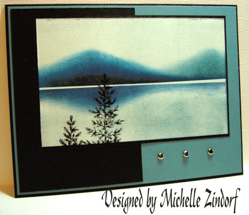
I decided today that I needed to make a non-froofroo card. With a manly birthday coming up, and father's day not too far off, it was a good time to try a Man card. If you've never made a Man card, they're notoriously difficult!
I saw a Zindorf card on SCS recently that got my schemer a'schemin'. I went trollin' da WEEB for a nice sunset photo, and found This. It was the basis for my colours.

I started by sponging a bit of Barely Banana in the centre of a 3.75" x 5" piece of Whisper White cardstock.


I added a bit of So Saffron at the top and bottom edge of the banana blob. "Banana Blob": kinda sounds like a fun drink!


Next I sponged some Groovy Guava around the blob. It's not looking so hot right now...


Next colour is Regal Rose. It's still looking pretty "eeyagh!!"


Some Lovely Lilac to fill it in (looks like heck, doesn't it?).


And some Brilliant Blue around the outside...


Some Basic Black across the bottom..


OK. Now here I got carried away playing and forgot to take some photos. (heheh, I just typed "phtoos" there. Sounds like spitting sunflower seeds.)
1: I masked off the bottom 1/3 and sponged the hills in black.
2: I masked off the hills, leaving a small gap between hill and reflection, and sponged matching hill reflections where the water would be.

Then I stamped some silhouetted trees from Lovely as a tree on the left and right sides. Oh, drat. One of my trees is floating in the water!


My final treatment for this layer was to add the Big Spruce tree from Lovely as a Tree 3 times. I also darkened up the black across the bottom, and the blue across the top.


Lastly, I punched ticket corners in the image layer, and matted it with black. I also added black brads in each corner. Both layers are then adhered to a Brilliant Blue card base.


Thanks for looking!

Thursday, May 15, 2008

Pretty Birthday

Is there a 12-step program for pretty cards? I seem to be stuck in a pretty-card design rut. I guess I have a bit of a froo-froo streak in me. Who knew it?!

This is a card for my m-i-l's birthday: Night of Navy and Whisper White paper from SU!, as well as the Birthday Wishes stamp (Sincere Salutations), the navy grosgrain ribbon, and the white gel-pen dots around the sentiment. The ovals are punched and embossed using my beloved nesties, and the background was dry-embossed using my cuttlebug and a large embossing folder.

Thanks for looking!
C
Posted by Picasa

Tuesday, May 13, 2008

Scrappy time

I've been scrapping! Unfortunately, there's precious little Stampin' Up! stuff used on this page... the retired Bodacious Bouquet flowers.. the pink ribbon.. the ink on the flowers. c'est tout!

It was a pain coming up with a color scheme, what with Eric's lovely hair colour. Wow, that's pink. The floral paper in the background made more sense when you could see the whole sheet.. I know you don't believe me, but there are pink flowers in that paper. I got to use my nifty new (and exceedingly inexpensive) color printer/scanner/copier to print the title and the journaling. What fun! Click on the photo if you want to see it up close.

C
Posted by Picasa

Friday, May 9, 2008

A Beautiful Thing

I made this card for Mother's Day (mom, if you're reading this, act surprised when I give it to you on Sunday!) It's a bunch of In Colour paper (soft sky, blue bayou and a dash of groovy guava) on Whisper White.

I inked up my Cuttlebug folder with soft sky, and ran the soft sky cardstock through it.
The sentiment is from the set A Beautiful Thing, which was stamped on Whisper white and punched with my oval scalloped Nestabilities. I made a Blue Bayou scalloped mat for it, and it has been sponged and then pierced around the edges.
The flowers are all from bud basics. Some are stamped in ink and cut out. Some are embossed with white embossing powder and cut out. So. Much. Cutting. The vines are from Peaceful Wishes. Some of the smaller flowers were punched out using cheap Marvy punches from the M-store. They're held together with simple silver brads. The flowers are raised a bit on the card with dimensionals. The sentiment on the inside reads: "Someone like you should be celebrated every day" and it's from the It's Your Birthday stamp set.

I can't take credit for the design. It's stolen almost verbatim from SCS.

Enjoy!
(click on the picture to see it close up).
Posted by Picasa

Wednesday, May 7, 2008

The little card that could - a scary trip into Corrie's thought processes

I was hoping for some sun today so I could take a nicer picture of this card, but the old "under the lamp" trick will have to suffice.

This is The Little Card that Could. It was almost The Little Card that Wasn't, because I kept getting stumped by it and nearly chucked it entirely. But, I kept trying just one more thing until I said "enough" and called it done.

It all started with the background paper. I got jazzed by some old SU! DS paper I saw used on a card on SplitcoastStampers. I figured I'd try to reproduce something similar by sponging: Blush Blossom, Pale Plum, Perfect Plum, and Bordering Blue on Whisper White cardstock. When I got finished I nearly tossed it right then and there! It reminded me of '80s vinyl kitchen chairs (you know the ones, with the white metal-tube backs?). Blech.

I thought to myself, "OK. How to make it better? aha!" and I added some Baroque Motifs flourishes faintly in Sahara Sand. But they were faint and boring. "Aha!" I thought again, "I know, I'll highlight them with some white gel pen. Ooo.. Ok. Now that looks just a little crazy." Discouraged I put the crazy 80's vinyl chair paper off to one side and started to think about the focal point.

The dominant colours in the scary paper were the plums and the bordering blue, so I knew I wanted to use those. I cut an oval out of Whisper White with my Nestabilities, and stamped the flower from Garden Silhouettes once in Pale Plum and once in Perfect Plum. "Yikes! Why does the pale plum look so pink!? Maybe there's just too much white showing." I grabbed a sponge and dabbed some Pale Plum around the edges. It still looked cruddy. So I set it aside.

At this point, I got up from my messy table and went to watch Good Eats. I was stumped.

Day 2: I returned to the messy table and scowled at the ugly chair paper and pink pale plum flowers.

"Stupid flowers." I said to no-one in particular. Clearly they needed a mat. I agonized over Bordering Blue and Perfect Plum, and ultimately settled on the Plum. The Blue was just... not... right somehow. I toyed with a ribbon border, or maybe a panel of Pale Plum horizontally across the card, but it all just looked feeble. I gave up again in disgust.

Day 3: I will do something with this card or die trying! I glared at the pink plum flowers again, and decided to add a bit darker sponging around the outside; I've been amused by markiesmom on SCS lately. I decided to continue in her style and add a bunch of crazy dots around the outside of the mat.

"Hmm. It's a bit better. It kinda reminds me of a cameo. What else can I do to this card? Maybe if I suspended the flowers from a ribbon....." Out came my trusty cropogator and in went a small, square plum eyelet from the 'Rama. I realized after the fact that it went in diagonally, but... I meant to do that! Ya! I inserted the ribbon and tried the oval portrait and landscape on the card. It wasn't great. There was a void in the top left of the oval that needed something.

"It needs words" I decided, and grabbed my Fundamental Phrases set, and pulled out "Happy" since I have a bunch of birthdays coming up. I stamped it in Perfect Plum on Pale Plum cardstock, and punched it out with my Large oval punch. Boring! But it did fill in the void nicely... "How can I improve this?" I punched a Perfect Plum oval with my small oval punch, then punched around its void with the large oval punch to create a frame. Still boring. "Hmm, what if I put some clear embossing enamel on the frame to make it look like hardware?" Out came the versamark, heat gun, and embossing powder. "Ooo... .shiny! That looks kinda neat".

I laid out both pieces landscape on the chair paper, and found there was something missing on the left. "Now how do I fill up THAT spot?" I mused. Scallop the edge? Add some brads? What about a photo corner? "I know! I'll stamp the flourish again in Perfect plum to fill up the corner." *stamp* "Ahhh, That looks nice."

As I was about to mount it on the card, I decided it needed a bit more framing, so I added the white mat; which of course was too dull. So I ticket corner punched each corner. Which was dull. So I added dots.. and then I thought "ENOUGH! This card will never be finished If I don't end this right now!" So I slapped it all together and called it done.

The end.

Let us never speak of it again.

If you're still shaking your head at my antics, take a moment to enjoy the slide show of my cards on the right-->

Sunday, May 4, 2008

It's DONE!!

It's been a long wait (we started the process on January 4), but I am elated to announce the arrival of the newest addition to our family: the finished basement!

We've started moving in, and we can't get the kids to stop playing down there. We've started filling the space after a pricey trip to IKEA, and there's still a lot more to get. But it's DONE.

The finished fireplace (note: lack of big-screen t.v. It'll come soon). We plan to put shelves on either side.

The shower and glass door. The sink:And my craft room with the spiffy cork floor:
I can't wait to show it to you!